Your work environment can have a positive affect on your energy, focus and creativity. Evolution and a person’s experiences and cultural background are a few of the fundamental mechanisms by which we translate colour into meaning. Our colour preferences are highly personal and generally relate back to experiences and objects that we like of the same colour.
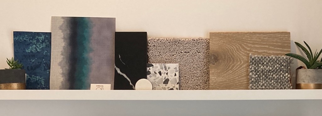
Here are a selection of colours that are uniquely suited to a working environment:
Blue
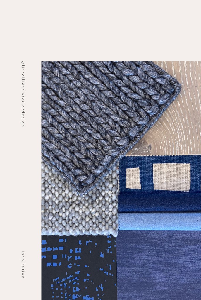
A blue sky represents calm weather, and blue is a common favourite across various different cultures. In general, people prefer colours that represent a clear sky and fresh water. Blue represents intellectual pursuits, trust, logic and communication, depth & stability. Blue provides focus, stimulating the mind & hence productivity. Blue is one of the most favoured colours, with approximately 57% of men and 35% of women preferring blue. A colour can be used at it’s brightest or most subtle as illustrated in the finishes schemes below.
Blue encourage(s) creativity because people associate it with “ocean, sky, freedom, openness, peacefulness”…a peaceful environment “makes people engage in exploratory behaviour and enhances their creativity”
Prof. Juliet Zhu, University of British Columbia
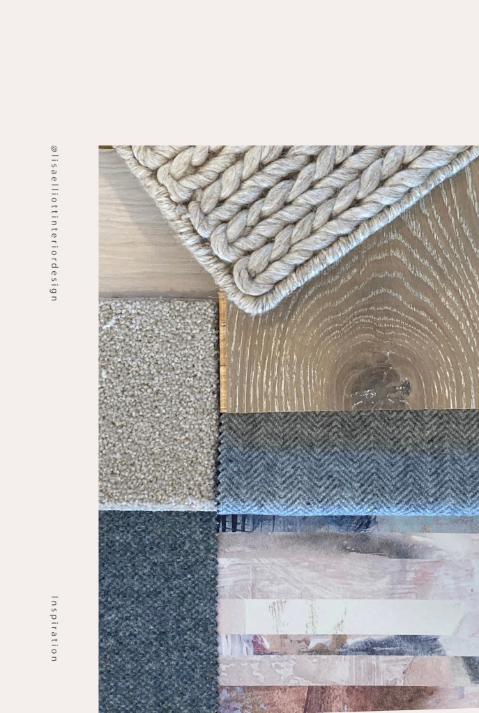
Green
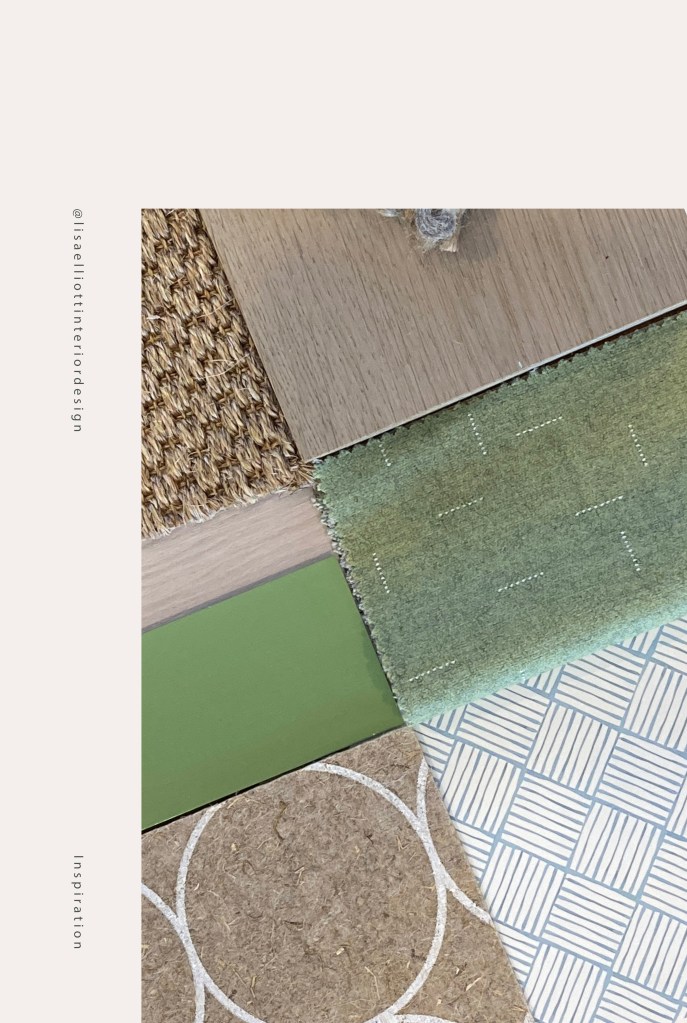
Green is associated with nature, and brings to mind freshness, lush growth and forests. Green represents balance, calmness, harmony & restoration. Green is easy on eyes. Green is another favourite colour, preferred by 14% of men and 14% of women. One of the best ways to introduce green is with living walls & plants; you’re introducing colour and their unique natural air purifying elements into your home office design.
Purple
Purple is associated with royalty, ambition and wealth because historically, the ingredients to make purple dye were rare & expensive to obtain; it is still associated with royalty today. Purple is also associated with spirituality & wisdom. Beware using shades which are too dark, which represent doom & gloom.
Yellow
Yellow represents creativity, optimism and friendliness. It can be used to enhance confidence, stimulate mental activity, positivity, creativity, and happiness. However, use yellow in moderation, as it can be fatiguing on the eye, create feelings of frustration & anger, and cause eyestrain. Beware: Dark yellow is often disliked, as it is evocative of off-putting things like urine & rotting food!
“How Wonderful yellow is. It stands for the sun”
Vincent Van Gogh
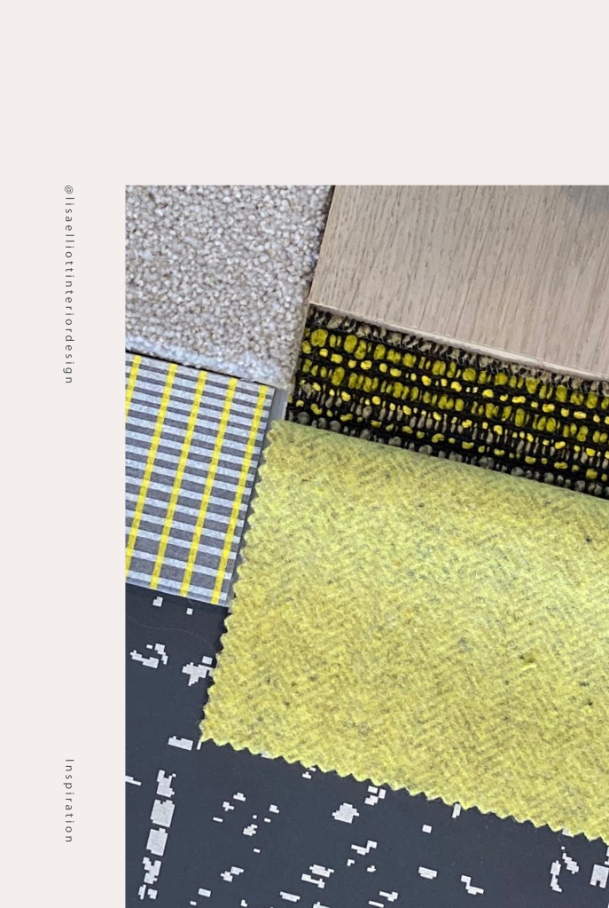
Pro tip: Consider a colour that does not relate to the scheme of the rest of your home, to provide a visual cue that you are entering a working space and to let you focus on your work.
For more advice, refer to my post “How to add colour to your home with paint”
Choosing colours for your home office differs from selecting colours for a professional office environment. Personal preference becomes a key player, whereas in a corporate environment, company branding often provides the main cues when selecting colours. Home offices are generally a smaller space, where colour needs to be used with care so as not to overwhelm the room.
Sources:
- Watch: what is colour psychology?
- Colour preferences shaped by experience
- Red boosts attention, blue creativity
- Why We Prefer Certain Colours
- True Colours – Breakdown of Colour Prefences by Gender
- The Colour Psychology of White
- The Colour Psychology of Yellow
- The Colour Psychology of Purple

(please pin the below graphic to your pinterest boards for reference)
Alright. Back to work!
OX,
Lisa
xx


One response to “What Colours should I use in my Workspace?”
[…] For more related advise, refer to my Post “What Colours should I use in my Workspace” […]
LikeLike